Mouse Image Distortion
A website animation featuring an image distortion in a curved, using the sin function, React, React Three Fiber and Framer Motion

Mask Section Transition
New
Background Image Parallax
New
Text Parallax
New
Sticky Footer
Perspective Section Transition
Text Along Path
SVG Path On Scroll
Horizontal Section
Zoom Parallax
Parallax Scroll
Horizontal Scroll
Text Gradient Scroll Opacity v2
Cards Parallax
3D perspective Scroll
SVG Mask Scroll
Smooth Parallax Scroll
Smooth Scroll
Pixel Transition
SVG Morph
Sliding Stairs Menu
Floating Image Gallery
Project Gallery Mouse Hover
Text Gradient Opacity On Scroll
Svg Curve Loading
Text Clip Mask On Scroll
Image slide project gallery
Mouse Image Gallery
Pixel Cursor Trailing
Text Mask Animation
3D Perspective Text
Project Gallery Colored Card
Cartoon Cursor Trailing
Olivier Larose
April 22, 2023
/
Beginner
/
Medium
A 3d perspective text animation made with CSS using the transform style, perspective and transform attribute. Created with React in a Next.js framework.
Live DemoSource codeVideo Tutorial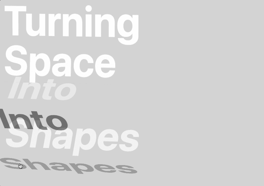
Let's start the project by creating a Next.js application. We can do that by running npx create-next-app@13.2.4 myApp inside of a terminal.
We can delete everything in the index.js and add our own HTML and CSS.
For the CSS, we're going to use CSS Module, so make sure to create a Home.module.css file inside of the styles folder. Thankfully, Next.js has built-in support for CSS Modules
Index.js
Home.mod...
1
import { useRef } from 'react';2
import styles from '../styles/Home.module.css'3
4
export default function Home() {5
6
const plane = useRef(null);7
8
return (9
<div className={styles.container}>10
<div ref={plane} className={styles.body}>11
<Text3d primary={"Turning"} secondary={"Turning"}/>12
<Text3d primary={"Space"} secondary={"Space"}/>13
<Text3d primary={"Into"} secondary={"Into"}/>14
<Text3d primary={"Shapes"} secondary={"Shapes"}/>15
</div>16
</div>17
)18
}19
20
function Text3d({primary, secondary}) {21
22
return (23
<div className={styles.textContainer}>24
<p className={styles.primary}>{primary}</p>25
<p className={styles.secondary}>{secondary}</p>26
</div>27
)28
}29
Here's a couple of important things to note about the HTML and CSS:
ref to the body, we will later use it to animate it.absolute to the secondary text, so it perfectly sits behind the primary text.relative to the textContainer (the parent), so that the secondary text has an absolute position based on it and not on the window.
Note: We are not seeing the secondary text, because it sits directly behind the primary text and the opacity is set at 0.
To animate the texts, we are going to use pure CSS for it. We will use the mutliple css properties and selectors to animate everything. Don't worry, we'll go over the explanation for each one of them.
Home.module.css
1
...2
3
.textContainer{4
...5
transform-style: preserve-3d;6
transition: transform 0.4s;7
}8
9
.textContainer p{10
...11
transition all 0.4s;12
}13
14
.textContainer .secondary{15
...16
transform: rotateX(-90deg) translateY(3.5vw);17
transform-origin: bottom center;18
}19
20
.textContainer:hover{21
transform: rotateX(90deg);22
}23
24
.textContainer:hover .primary{25
transform: translateY(-100%);26
opacity: 0;27
}28
29
.textContainer:hover .secondary{30
opacity: 1;31
}
Here's a couple of important things to note about the CSS:
transform-style to be preserve-3d on the parent, to indicate that the children should be positioned in 3D space.-90deg. That way, when we rotate the parent, the secondary text will already be in the good position for the animation. We also add a slight y-axis adjustement to make it look more realistic.90deg to rotate on itself and give the 3D illusion effect.-100% to also give the 3D illusion effect.Let's spice up the animation by adding a 3d perspective to the container of all the words. To do that we'll use some javascript and add 3 different values to the transform property of the body based on the position of the cursor:
Index.jsx
1
...2
export default function Home() {3
4
const plane = useRef(null);5
const maxRotate = 45;6
7
const manageMouseMove = (e) => {8
const x = e.clientX / window.innerWidth9
const y = e.clientY / window.innerHeight10
const perspective = window.innerWidth * 4;11
const rotateX = maxRotate * x - maxRotate / 2;12
const rotateY = (maxRotate * y - maxRotate / 2) * -1;13
plane.current.style.transform = "perspective(${perspective}px) rotateX(${rotateY}deg) rotateY(${rotateX}deg)"14
}15
16
return (17
<div onMouseMove={(e) => {manageMouseMove(e)}} className={styles.container}>18
<div ref={plane} className={styles.body}>19
...20
Here's a couple of important things to note about the JS:
perspective: Since the size of the text is based on the window, the amount of perspective we give the body is an absolute value based on the size of the window.rotateX: a value between 0 and maxRotate based on the x position of the mouse relative to the windowrotateY: a value between 0 and maxRotate based on the y position of the mouse relative to the windowLine 13: Note that the rotateX and rotateY are reversed.
That was it for this animation, pretty fun considering the fact that we only used CSS. See you next time
Hope you learned a lot :)
-Oli
June 2, 2024
A website animation featuring an image distortion in a curved, using the sin function, React, React Three Fiber and Framer Motion
May 4, 2024
A website tutorial on making a paint reveal / erasing effect using the destination out blend mode of the canvas API, made with React and Next.js
March 8, 2024
A website tutorial featuring a moving cursor on mouse move, colored with CSS blend mode difference, made with React and GSAP. Inspired by https://trionn.com/