Awwwards Side Menu
A website tutorial featuring the rebuild of a menu from an Awwwards winning website, made with Framer Motion and Next.js, inspired by: https://agencecartier.com/fr

Mask Section Transition
New
Background Image Parallax
New
Text Parallax
New
Sticky Footer
Perspective Section Transition
Text Along Path
SVG Path On Scroll
Horizontal Section
Zoom Parallax
Parallax Scroll
Horizontal Scroll
Text Gradient Scroll Opacity v2
Cards Parallax
3D perspective Scroll
SVG Mask Scroll
Smooth Parallax Scroll
Smooth Scroll
Pixel Transition
SVG Morph
Sliding Stairs Menu
Floating Image Gallery
Project Gallery Mouse Hover
Text Gradient Opacity On Scroll
Svg Curve Loading
Text Clip Mask On Scroll
Image slide project gallery
Mouse Image Gallery
Pixel Cursor Trailing
Text Mask Animation
3D Perspective Text
Project Gallery Colored Card
Cartoon Cursor Trailing
Olivier Larose
July 13, 2023
/
Intermediate
/
Medium
A website tutorial featuring an animated menu that comes from an awwwards winning website. Features a stair-like animation with an infinite slider. Inspired by https://k72.ca/travail
Live DemoSource code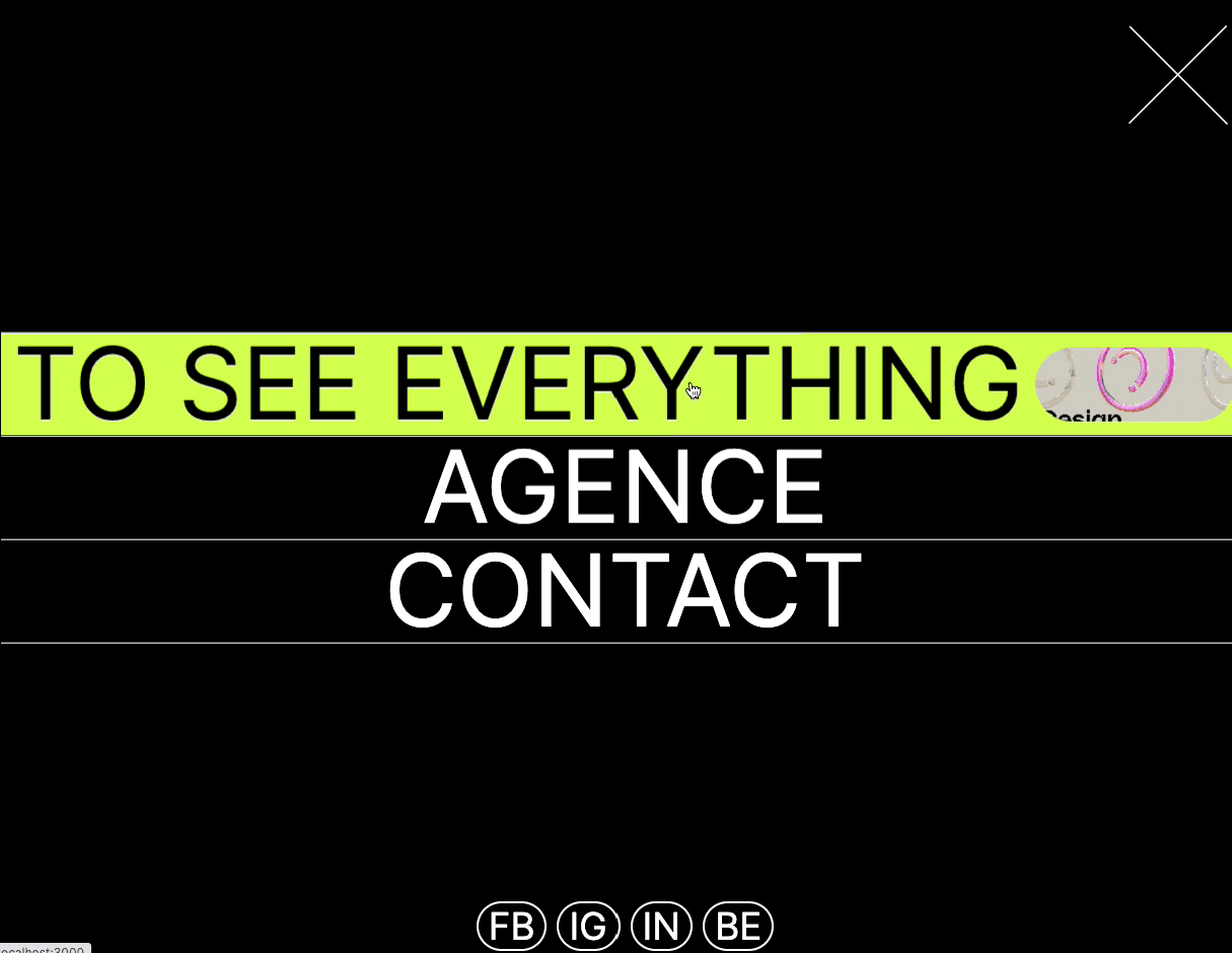
Let's start the project by creating a Next.js application. We can do that by running npx create-next-app@latest client inside of a terminal.
We can delete everything in the page.js , global.css and page.module.css and add our own HTML and CSS, to start with a nice blank application.
npm i sass.The main header is imported inside the Layout.js, that way, it will persist across multiple pages.
layout.js
1
import './globals.css'2
import { Inter } from 'next/font/google'3
import Header from '../components/header';4
5
const inter = Inter({ subsets: ['latin'] })6
7
export const metadata = {8
title: 'Create Next App',9
description: 'Generated by create next app',10
}11
12
export default function RootLayout({ children }) {13
return (14
<html lang="en">15
<body className={inter.className}>16
<Header />17
{children}18
</body>19
</html>20
)21
}
We're going to start off this animation by creating the burger menu. It's a simple Div in position fixed with an SVG inside of it. There's initially a background with a height of 0. When hovering the burger menu, this height of the background is animated using CSS.
Header/index.jsx
1
'use client';2
import { useState } from 'react'3
import Burger from './burger';4
5
export default function () {6
7
const [menuIsOpen, setMenuIsOpen] = useState(false);8
9
return (10
<div>11
<Burger openMenu={() => {setMenuIsOpen(true)}}/>12
</div>13
)14
}
Burger/i...
Burger/s...
1
import styles from './style.module.scss';2
3
export default function ({openMenu}) {4
return (5
<div onClick={() => {openMenu()}} className={styles.button}>6
<div className={styles.background}></div>7
<svg width="56" height="7" viewBox="0 0 56 7" fill="none" xmlns="http://www.w3.org/2000/svg">8
<line x1="56" y1="0.5" x2="4.37114e-08" y2="0.500005" stroke="white"/>9
<line x1="56" y1="6.5" x2="28" y2="6.5" stroke="white"/>10
</svg>11
<p>Menu</p>12
</div>13
)14
}
To make the Stairs Component, we'll start using the AnimatePresence hook from Framer Motion, which will allow us to force the component to trigger it's exit animation before being unmounted.
Header/index.jsx
1
...2
export default function () {3
4
const [menuIsOpen, setMenuIsOpen] = useState(false);5
6
return (7
<div>8
<Burger openMenu={() => {setMenuIsOpen(true)}}/>9
<AnimatePresence mode="wait">10
{11
menuIsOpen && <Stairs />12
}13
</AnimatePresence>14
</div>15
)16
}
Stairs/i...
Stairs/s...
anim.js
1
import React from 'react'2
import styles from './style.module.scss';3
import { height, background, mountAnim } from '../anim';4
import { motion } from 'framer-motion';5
6
export default function index() {7
8
return (9
<div className={styles.stairs}>10
{11
[...Array(5)].map( (_, index) => {12
return <Stair key={index} index={index}/>13
})14
}15
<Background />16
</div>17
)18
}19
20
const Stair = ({index}) => {21
return <motion.div22
variants={height}23
{...mountAnim}24
custom={4 - index}25
className={styles.stair}>26
</motion.div>27
}28
29
const Background = () => {30
return <motion.div31
variants={background}32
{...mountAnim}33
className={styles.background}>34
</motion.div>35
}
Couple of notes about the code:
height animation declared in the anim.js file. The delay is created using the custom attribute and the index.background variant.The first thing we need to do is import the component inside of the Header. I also put it inside the AnimatePresence to force an exit animation before unmounting.
Header/index.jsx
1
...2
export default function () {3
4
const [menuIsOpen, setMenuIsOpen] = useState(false);5
6
return (7
<div>8
<Burger openMenu={() => {setMenuIsOpen(true)}}/>9
<AnimatePresence mode="wait">10
{11
menuIsOpen && <>12
<Stairs />13
<Menu closeMenu={() => {setMenuIsOpen(false)}}/>14
</>15
}16
</AnimatePresence>17
</div>18
)19
}
The header has 3 sections:
Menu/ind...
Menu/sty...
anim.js
1
import { motion } from 'framer-motion';2
import { opacity, slideLeft, mountAnim } from '../anim';3
import styles from './style.module.scss';4
import Link from './link';5
6
const menu = [7
{8
title: "Projects",9
description: "To See Everything",10
images: ['projects1.jpg', 'projects2.jpg']11
},12
{13
title: "Agence",14
description: "To Learn Everything",15
images: ['agence1.jpg', 'agence2.jpg']16
},17
{18
title: "Contact",19
description: "To Send a FAX",20
images: ['contact1.jpg', 'contact2.jpg']21
}22
]23
24
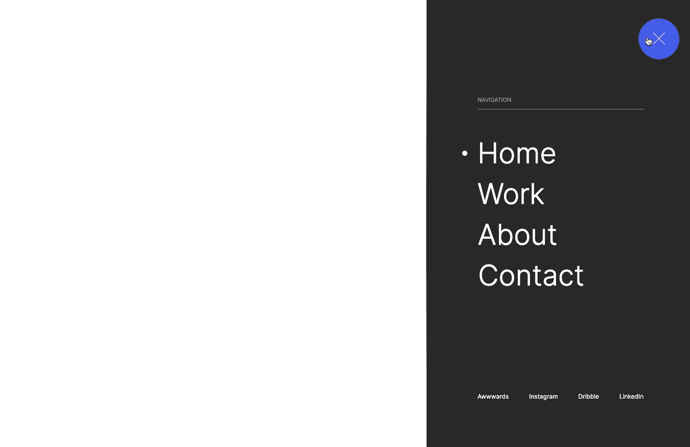
export default function index({closeMenu}) {25
26
return (27
<div className={styles.menu}>28
29
<div className={styles.header}>30
<motion.svg31
variants={slideLeft}32
{...mountAnim}33
onClick={() => {closeMenu()}}34
width="68"35
height="68"36
viewBox="0 0 68 68"37
fill="none"38
xmlns="http://www.w3.org/2000/svg">39
<path d="M1.5 1.5L67 67" stroke="white"/>40
<path d="M66.5 1L0.999997 66.5" stroke="white"/>41
</motion.svg>42
</div>43
44
<div className={styles.body}>45
{46
menu.map( (el, index) => {47
return <Link data={el} index={index} key={index}/>48
})49
}50
</div>51
52
<motion.div53
variants={opacity}54
{...mountAnim}55
custom={0.5}56
className={styles.footer}>57
<a>FB</a>58
<a>IG</a>59
<a>IN</a>60
<a>BE</a>61
</motion.div>62
63
</div>64
)65
}
And here's the Link component:
Link/ind...
Link/sty...
1
import styles from './style.module.scss'2
import { motion } from 'framer-motion';3
import { mountAnim, rotateX } from '../../anim';4
import Link from 'next/link';5
6
export default function link({data, index}) {7
8
const { title, description, images } = data;9
return (10
<motion.div11
variants={rotateX}12
{...mountAnim}13
custom={index}14
className={styles.el}15
>16
<Link href="/">{title}</Link>17
</motion.div>18
)19
}
Couple of notes about the code:
rotateX(90deg), perspective: 80vw and transform-origin: top. The delay is created with the custom attribute and the index.The slider component is definitely the hardest part of this tutorial. It's composed of two main animations
We can modify the previous Link component that we had and add the slider:
Link/ind...
Link/sty...
1
...2
import { motion, useAnimate } from 'framer-motion';3
import Image from 'next/image';4
import { useRef } from 'react';5
import Link from 'next/link';6
7
export default function link({data, index}) {8
const { title, description, images } = data;9
const [scope, animate] = useAnimate();10
const outer = useRef(null);11
const inner = useRef(null);12
13
const animateIn = async (e) => {14
const bounds = e.target.getBoundingClientRect();15
const direction = e.clientY < bounds.top + (bounds.height / 2) ? -1 : 1;16
17
await animate(outer.current, {top: `${direction * 100}%`}, {duration:0})18
await animate(inner.current, {top: `${-1 * direction * 100}%`}, {duration:0})19
20
animate([outer.current, inner.current], {top: "0%"}, {duration:0.3})21
}22
23
const animateOut = (e) => {24
const bounds = e.target.getBoundingClientRect();25
const direction = e.clientY < bounds.top + (bounds.height / 2) ? -1 : 1;26
27
animate(outer.current, {top: `${direction * 100}%`}, {duration:0.3})28
animate(inner.current, {top: `${-1 * direction * 100}%`}, {duration:0.3})29
}30
31
return (32
<motion.div33
...34
onMouseEnter={ (e) => {animateIn(e)}}35
onMouseLeave={(e) => {animateOut(e)}}36
ref={scope}37
>38
<Link href="/">{title}</Link>39
<div ref={outer} className={styles.outer}>40
<div ref={inner} className={styles.inner}>41
{42
[...Array(2)].map( (_, index) => {43
return <SliderContent key={index} images={images} description={description}/>44
})45
}46
</div>47
</div>48
</motion.div>49
)50
}51
52
const SliderContent = ({images, description}) => {53
return <div className={styles.container}>54
<div className={styles.imageContainer}>55
<Image56
src={`/images/${images[0]}`}57
fill58
alt="image"59
/>60
</div>61
<p>{description}</p>62
<div className={styles.imageContainer}>63
<Image64
src={`/images/${images[1]}`}65
fill66
alt="image"67
/>68
</div>69
<p>{description}</p>70
</div>71
}
Couple notes about the code above:
useAnimate() from Framer motion to create imperative animations.top:0%We're offically done with this animation!
Insane menu made quite easily with Framer Motion and CSS! I was quite shook to see how we can animate two divs at the same time to create this effect. Almost feels like a glitch. Hope you learned something!
-Oli

Oct 30, 2023
A website tutorial featuring the rebuild of a menu from an Awwwards winning website, made with Framer Motion and Next.js, inspired by: https://agencecartier.com/fr
Jul 4, 2023
A website tutorial on how to make an awwwards curved menu using Nextjs, GSAP and Framer Motion. A curve is created using SVG path commands Inspired by https://dennissnellenberg.com/.

June 28, 2023
A website tutorial on how to make an Awwwards Navigation bar menu using Nextjs and Framer Motion. Inspired by the awwwards winning website https://props.studiolumio.com/