Awwwards Side Menu
A website tutorial featuring the rebuild of a menu from an Awwwards winning website, made with Framer Motion and Next.js, inspired by: https://agencecartier.com/fr

Mask Section Transition
New
Background Image Parallax
New
Text Parallax
New
Sticky Footer
Perspective Section Transition
Text Along Path
SVG Path On Scroll
Horizontal Section
Zoom Parallax
Parallax Scroll
Horizontal Scroll
Text Gradient Scroll Opacity v2
Cards Parallax
3D perspective Scroll
SVG Mask Scroll
Smooth Parallax Scroll
Smooth Scroll
Pixel Transition
SVG Morph
Sliding Stairs Menu
Floating Image Gallery
Project Gallery Mouse Hover
Text Gradient Opacity On Scroll
Svg Curve Loading
Text Clip Mask On Scroll
Image slide project gallery
Mouse Image Gallery
Pixel Cursor Trailing
Text Mask Animation
3D Perspective Text
Project Gallery Colored Card
Cartoon Cursor Trailing
Olivier Larose
June 28, 2023
/
Intermediate
/
Medium
A website tutorial on how to make an Awwwards Navigation bar menu using Nextjs and Framer Motion. Inspired by the awwwards winning website https://props.studiolumio.com/
Live DemoSource codeVideo Tutorial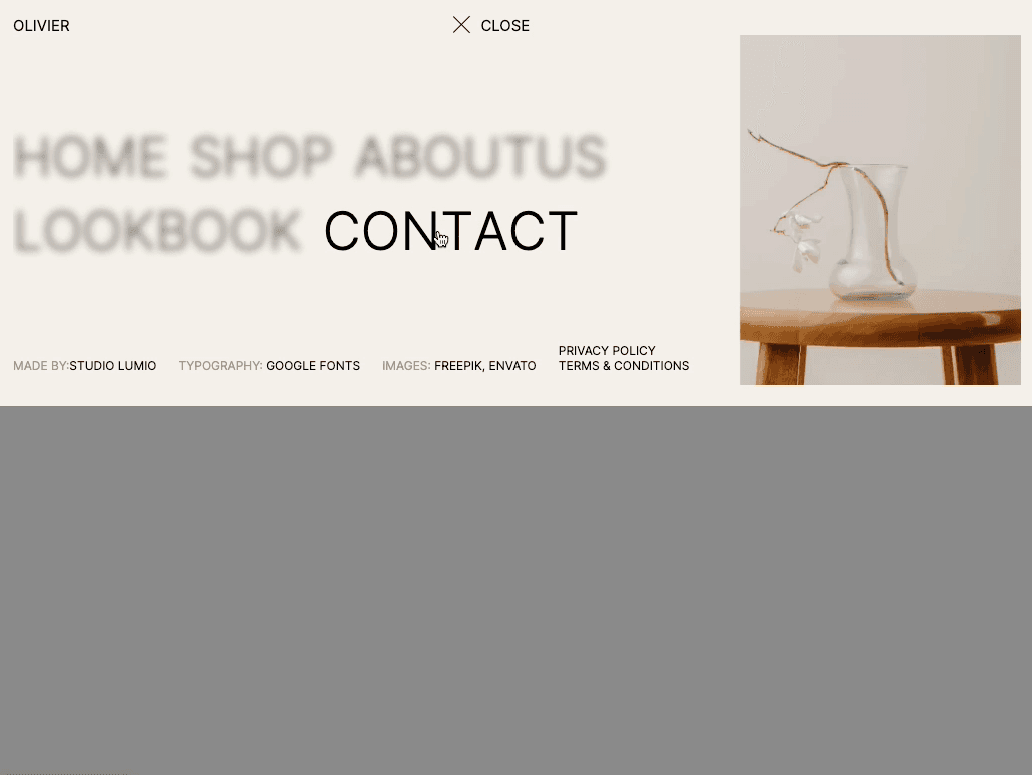
Let's start the project by creating a Next.js application. We can do that by running npx create-next-app@latest client inside of a terminal.
We can delete everything in the page.js , global.css and page.module.css and add our own HTML and CSS, to start with a nice blank application.
layout.js root component.The Header component is create inside a src/components/ folder.
layout.j...
globals....
1
import './globals.css'2
import { Inter } from 'next/font/google'3
import Header from '../components/header';4
5
const inter = Inter({ subsets: ['latin'] })6
7
export const metadata = {8
title: 'Create Next App',9
description: 'Generated by create next app',10
}11
12
export default function RootLayout({ children }) {13
return (14
<html lang="en">15
<body className={inter.className}>16
<Header />17
{children}18
</body>19
</html>20
)21
}
The Header Component acts as the parent of all the other components. It will also contain the state, which will track if the nav is active or not.
For the animation, Framer Motion is used, to install it we can run: npm i framer-motion
Header/i...
Header/s...
Header/a...
1
'use client';2
import styles from './style.module.css';3
import Link from 'next/link';4
import { useState } from 'react';5
import { motion } from 'framer-motion';6
import { opacity } from './anim';7
8
export default function index() {9
10
const [isActive, setIsActive] = useState(false);11
12
return (13
<div className={styles.header}>14
<div className={styles.bar}>15
<Link href="/">Olivier</Link>16
<div onClick={() => {setIsActive(!isActive)}} className={styles.el}>17
<div className={`${styles.burger} ${isActive ? styles.burgerActive : ""}`}></div>18
<div className={styles.label}>19
<motion.p variants={opacity} animate={!isActive ? "open" : "closed"}>Menu</motion.p>20
<motion.p variants={opacity} animate={isActive ? "open" : "closed"}>Close</motion.p>21
</div>22
</div>23
<motion.div variants={opacity} animate={!isActive ? "open" : "closed"} className={styles.shopContainer}>24
<p className={styles.shop}>Shop</p>25
<div className={styles.el}>26
<svg width="19" height="20" viewBox="0 0 19 20" fill="none" xmlns="http://www.w3.org/2000/svg"><path d="M1.66602 1.66667H2.75449C2.9595 1.66667 3.06201 1.66667 3.1445 1.70437C3.2172 1.73759 3.2788 1.79102 3.32197 1.85829C3.37096 1.93462 3.38546 2.0361 3.41445 2.23905L3.80887 5M3.80887 5L4.68545 11.4428C4.79669 12.2604 4.85231 12.6692 5.04777 12.977C5.22 13.2481 5.46692 13.4637 5.75881 13.5978C6.09007 13.75 6.50264 13.75 7.32777 13.75H14.4593C15.2448 13.75 15.6375 13.75 15.9585 13.6087C16.2415 13.4841 16.4842 13.2832 16.6596 13.0285C16.8585 12.7397 16.9319 12.3539 17.0789 11.5823L18.1819 5.79141C18.2337 5.51984 18.2595 5.38405 18.222 5.27792C18.1892 5.18481 18.1243 5.1064 18.039 5.05668C17.9417 5 17.8035 5 17.527 5H3.80887ZM8.33268 17.5C8.33268 17.9602 7.95959 18.3333 7.49935 18.3333C7.03911 18.3333 6.66602 17.9602 6.66602 17.5C6.66602 17.0398 7.03911 16.6667 7.49935 16.6667C7.95959 16.6667 8.33268 17.0398 8.33268 17.5ZM14.9993 17.5C14.9993 17.9602 14.6263 18.3333 14.166 18.3333C13.7058 18.3333 13.3327 17.9602 13.3327 17.5C13.3327 17.0398 13.7058 16.6667 14.166 16.6667C14.6263 16.6667 14.9993 17.0398 14.9993 17.5Z" stroke="#4D3D30" strokeWidth="1.5" strokeLinecap="round" strokeLinejoin="round"></path></svg>27
<p>Cart(0)</p>28
</div>29
</motion.div>30
</div>31
</div>32
)33
}
Notes about the code above:
We import the Nav inside of the Header using AnimatePresence from Framer Motion.
Header/index.jsx
1
...2
import { motion, AnimatePresence } from 'framer-motion';3
import Nav from './nav';4
5
export default function index() {6
...7
const [isActive, setIsActive] = useState(false);8
9
return (10
<div className={styles.header}>11
...12
<AnimatePresence mode="wait">13
{isActive && <Nav/>}14
</AnimatePresence>15
</div>16
)17
}
mode="wait" is extremely important here, it forces the Nav and all its children to trigger their exit animation before unmounting. The Nav component is the parent of 3 other components:
The 3 components are created in the src/header/nav folder:
Nav/inde...
Nav/styl...
Header/a...
1
'use client';2
import styles from './style.module.css';3
import { useState } from 'react';4
import { motion } from 'framer-motion';5
import { height } from '../anim';6
import Body from './Body';7
import Footer from './Footer';8
import Image from './Image';9
10
const links = [11
{12
title: "Home",13
href: "/",14
src: "home.png"15
},16
{17
title: "Shop",18
href: "/shop",19
src: "shop.png"20
},21
{22
title: "About Us",23
href: "/about",24
src: "home.png"25
},26
{27
title: "Lookbook",28
href: "/lookbook",29
src: "lookbook.png"30
},31
{32
title: "Contact",33
href: "/contact",34
src: "contact.png"35
}36
]37
38
export default function Index() {39
40
const [selectedLink, setSelectedLink] = useState({isActive: false, index: 0});41
42
return (43
<motion.div variants={height} initial="initial" animate="enter" exit="exit" className={styles.nav}>44
<div className={styles.wrapper}>45
<div className={styles.container}>46
<Body links={links} selectedLink={selectedLink} setSelectedLink={setSelectedLink}/>47
<Footer />48
</div>49
<Image src={links[selectedLink.index].src} selectedLink={selectedLink}/>50
</div>51
</motion.div>52
)53
}
Notes about the code above:
Now can we work on the Body component and see how all of that fits together.
Body/ind...
Body/sty...
Header/a...
1
import { motion } from 'framer-motion';2
import Link from 'next/link';3
import styles from './style.module.css';4
import { blur, translate } from '../../anim';5
6
export default function Body({links, selectedLink, setSelectedLink}) {7
8
const getChars = (word) => {9
let chars = [];10
word.split("").forEach( (char, i) => {11
chars.push(12
<motion.span13
custom={[i * 0.02, (word.length - i) * 0.01]}14
variants={translate} initial="initial"15
animate="enter"16
exit="exit"17
key={char + i}>18
{char}19
</motion.span>20
)21
})22
return chars;23
}24
25
return (26
<div className={styles.body}>27
{28
links.map( (link, index) => {29
const { title, href } = link;30
return <Link key={`l_${index}`} href={href}>31
<motion.p32
onMouseOver={() => {setSelectedLink({isActive: true, index})}}33
onMouseLeave={() => {setSelectedLink({isActive: false, index})}}34
variants={blur}35
animate={selectedLink.isActive && selectedLink.index != index ? "open" : "closed"}>36
{getChars(title)}37
</motion.p>38
</Link>39
})40
}41
</div>42
)43
}
Couple notes about the code above:
custom value.The image component is intrinsically linked to the Body Component. Since the Body mutates the state, the Image component will then consume it to know which image to show:
Image/in...
Image/st...
Header/a...
1
import React from 'react'2
import { motion } from 'framer-motion';3
import Image from 'next/image';4
import styles from './style.module.css';5
import { opacity } from '../../anim';6
7
export default function Index({src, selectedLink}) {8
return (9
<motion.div variants={opacity} initial="initial" animate={selectedLink.isActive ? "open" : "closed"} className={styles.imageContainer}>10
<Image11
src={`/images/${src}`}12
fill={true}13
alt="image"14
/>15
</motion.div>16
)17
}
The footer is pretty straight forward, just a bit of HTML, CSS and the same translate animation as the Body component but we a fixed delay.
Footer/i...
Footer/s...
Header/a...
1
import styles from './style.module.css';2
import { translate } from '../../anim';3
import { motion } from 'framer-motion';4
5
export default function Footer() {6
return (7
<div className={styles.footer}>8
<ul>9
<motion.li10
custom={[0.3, 0]}11
variants={translate} initial="initial"12
animate="enter"13
exit="exit">14
<span>Made by:</span>Studio Lumio15
</motion.li>16
</ul>17
<ul>18
<motion.li19
custom={[0.3, 0]}20
variants={translate} initial="initial"21
animate="enter"22
exit="exit">23
<span>Typography:</span> Google Fonts24
</motion.li>25
</ul>26
<ul>27
<motion.li28
custom={[0.3, 0]}29
variants={translate} initial="initial"30
animate="enter"31
exit="exit">32
<span>Images:</span> Freepik, Envato33
</motion.li>34
</ul>35
<ul>36
<motion.li37
custom={[0.3, 0]}38
variants={translate} initial="initial"39
animate="enter"40
exit="exit">41
Privacy Policy42
</motion.li>43
<motion.li44
custom={[0.3, 0]}45
variants={translate} initial="initial"46
animate="enter"47
exit="exit">48
Terms & Conditions49
</motion.li>50
</ul>51
</div>52
)53
}
The last touch we can to wrap everything up and make the menu look even better is to add a sliding background inside of the Header component.
Header/i...
Header/s...
Header/a...
1
'use client';2
import styles from './style.module.css';3
import { useState } from 'react';4
import { motion, AnimatePresence } from 'framer-motion';5
import { opacity, background } from './anim';6
...7
8
export default function index() {9
10
const [isActive, setIsActive] = useState(false);11
12
return (13
<div className={styles.header}>14
...15
<motion.div variants={background} initial="initial" animate={isActive ? "open" : "closed"} className={styles.background}></motion.div>16
...17
</div>18
)19
}
We're offically done with this Navbar!
Hope you liked this tutorial, it's quite heavy since there is a lot of HTML and CSS. But if you learned one thing from all of that then my purpose is completed.
-Oli

Oct 30, 2023
A website tutorial featuring the rebuild of a menu from an Awwwards winning website, made with Framer Motion and Next.js, inspired by: https://agencecartier.com/fr
Jul 13, 2023
A website tutorial featuring an animated menu that comes from an awwwards winning website. Features a stair-like animation with an infinite slider. Inspired by https://k72.ca/travail
Jul 4, 2023
A website tutorial on how to make an awwwards curved menu using Nextjs, GSAP and Framer Motion. A curve is created using SVG path commands Inspired by https://dennissnellenberg.com/.