Mouse Image Distortion
A website animation featuring an image distortion in a curved, using the sin function, React, React Three Fiber and Framer Motion

Mask Section Transition
New
Background Image Parallax
New
Text Parallax
New
Sticky Footer
Perspective Section Transition
Text Along Path
SVG Path On Scroll
Horizontal Section
Zoom Parallax
Parallax Scroll
Horizontal Scroll
Text Gradient Scroll Opacity v2
Cards Parallax
3D perspective Scroll
SVG Mask Scroll
Smooth Parallax Scroll
Smooth Scroll
Pixel Transition
SVG Morph
Sliding Stairs Menu
Floating Image Gallery
Project Gallery Mouse Hover
Text Gradient Opacity On Scroll
Svg Curve Loading
Text Clip Mask On Scroll
Image slide project gallery
Mouse Image Gallery
Pixel Cursor Trailing
Text Mask Animation
3D Perspective Text
Project Gallery Colored Card
Cartoon Cursor Trailing
Olivier Larose
January 18, 2024
/
Advanced
/
Medium
How to Make a Text Gooey Morph Effect Using SVG filters feGaussianBlur and feColorMatrix. All inside a Next.js application and animated with Framer Motion. Inspired by: https://codepen.io/supah/pen/abVGjVq
Live DemoSource code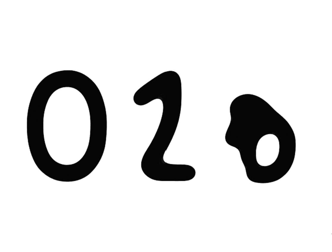
To find out more on how to make this animation, you can check these links, they greatly helped me understand this animation:
This animation presents multiple interesting animation techniques, mainly on knowing how to work with SVG filters and also reading and animating along an SVG path.
Let's start the project by creating a Next.js application. We can do that by running npx create-next-app@latest client inside of a terminal.
We can delete everything in the page.js , global.css and page.module.css and add our own HTML and CSS, to start with a nice blank application.
npm i sass.npm i framer-motion.Here's how this animation is made:
pathcirclefeGaussianBlur and a feColorMatrix filter on the circles.The first step is to render all the numbers as SVG path.
The goal here is to draw an SVG path for each numbers you need. You can that in either Figma or Illustrator and use this tool to visualize your SVG code.
Here I put the d attribute of each of my numbers inside an array that I can then loop to render all of them.
Array of d attributes
1
const numbers = [2
"M87.9,79.2c1.1-0.4,53.7-39.2,54.9-39.1v180.5",3
"M81.7,85.7c-1.4-67,112.3-55.1,90.2,11.6c-12.6,32-70.6,83.7-88.8,113.7h105.8",4
"M74.8,178.5c3,39.4,63.9,46.7,88.6,23.7c34.3-35.1,5.4-75.8-41.7-77c29.9,5.5,68.7-43.1,36.5-73.7 c-23.4-21.5-76.5-11.1-78.6,25",5
"M161.9,220.8 161.9,41 72.6,170.9 208.2,170.9",6
"M183.2,43.7H92.1l-10,88.3c0,0,18.3-21.9,51-21.9s49.4,32.6,49.4,48.2c0,22.2-9.5,57-52.5,57s-51.4-36.7-51.4-36.7"7
]
And here I render all of them and dynamically add them inside an array:
page.js
1
export default function Home() {2
const paths = useRef([]);3
return (4
<main className={styles.main}>5
<svg viewBox="0 0 256 256">6
<g>7
{8
numbers.map((path, i) => {9
return <path key={`p_${i}`} ref={ref => paths.current[i] = ref} d={path}/>10
})11
}12
</g>13
</svg>14
</main>15
)16
}
To create the Gooey effect, I'll move a bunch of circles one after the other along the line of each number's SVG path.
The first step to do that is render 30 circles:
page.js
1
export default function Home() {2
3
...4
const circles = useRef([]);5
const nbOfCircles = 30;6
const radius = 20;7
8
return (9
<main className={styles.main}>10
<svg viewBox="0 0 256 256">11
...12
<g>13
{14
[...Array(nbOfCircles)].map( (_, i) => {15
return <circle key={`c_${i}`} ref={ref => circles.current[i] = ref} cx="128" cy="128" r={radius} />16
})17
}18
</g>19
</svg>20
</main>21
)22
}
Each circle has a cx and cy value of 128, which is the center point of the SVG, which has a bounding box of 0 0 256 256.
To control the animation, we can render a bunch of paragraphs that will toggle a state on click:
page.js
1
const [index, setIndex] = useState(0);2
3
return (4
<main className={styles.main}>5
<div className={styles.numbers}>6
{7
numbers.map((_, i) => {8
return <p style={{color: i == index ? "red" : "black"}} onClick={() => {setIndex(i)}}>{i + 1}</p>9
})10
}11
</div>12
...13
) </main>14
Here when the index gets changed, we take each circle and animate them along the path of each number:
page.js
1
const [index, setIndex] = useState(0);2
const circles = useRef([]);3
const paths = useRef([]);4
const nbOfCircles = 30;5
6
useEffect( () => {7
const length = paths.current[index].getTotalLength();8
const step = length / nbOfCircles;9
10
circles.current.forEach((circle, i) => {11
const { x, y } = paths.current[index].getPointAtLength(i * step);12
animate(circle,13
{ cx: x, cy: y},14
{ delay: i * 0.025, ease: "easeOut"}15
)16
})17
}, [index])
Two filters are needed to create the gooey effect:
stdDeviation.page.js
1
<defs>2
<filter id="filter">3
<feGaussianBlur in="SourceAlpha" stdDeviation="20" result="blur" />4
<feColorMatrix in="blur" mode="matrix" values="1 0 0 0 0 0 1 0 0 0 0 0 1 0 0 0 0 0 25 -15" result="filter" />5
</filter>6
</defs>
The feGaussianBlur is pretty straight forward and doesn't need much explanation. It's a standard gaussian blur that's adjusted with the stdDeviation.
page.js
1
<feGaussianBlur in="SourceAlpha" stdDeviation="20" result="blur" />
However, the feColorMatrix is quite tricky and necessary to understand how the blur gooey effect is created. I highly suggest reading this in order to understand.
First of all, the identity matrix, meaning when there are no transformations applied by the filter looks like this:
Identity matrix
1
R G B A W2
R' | 1 0 0 0 0 |3
G' | 0 1 0 0 0 |4
B' | 0 0 1 0 0 |5
A' | 0 0 0 1 0 |
Then what we do is modify that matrix in the alpha channel only.
Modified matrix
1
R G B A W2
R' | 1 0 0 0 0 |3
G' | 0 1 0 0 0 |4
B' | 0 0 1 0 0 |5
A' | 0 0 0 25 -15 |
And here's how each number of the alpha channel of the matrix is added to create the new alpha:
Modified matrix
1
A' = a1*R + a2*G + a3*B + a4*A + a5
Here's a little explanation:
feGaussianBlur comes and blur the circles, the alpha of each pixel can now be all the numbers between 0 and 1 instead of just being either 0 or 1.feColorMatrix will be applied after the feGaussianBlur. So the alpha of each pixel that is now between 0 and 1 will be multiplied by the new feColorMatrix alpha values (current_alpha * 25 - 15) and note that the final A' will be clamped between 0 and 1.So in the end we would have something like this:
page.js
1
<feColorMatrix in="blur" mode="matrix" values="1 0 0 0 0 0 1 0 0 0 0 0 1 0 0 0 0 0 25 -15" result="filter" />
That's it for this tutorial!
It was very interesting for me to study how we can animate things along the line of an SVG and also how we can apply SVG's filter to create awesome effects! Hope you learned something.
-Oli
June 2, 2024
A website animation featuring an image distortion in a curved, using the sin function, React, React Three Fiber and Framer Motion
May 4, 2024
A website tutorial on making a paint reveal / erasing effect using the destination out blend mode of the canvas API, made with React and Next.js
March 8, 2024
A website tutorial featuring a moving cursor on mouse move, colored with CSS blend mode difference, made with React and GSAP. Inspired by https://trionn.com/